 |
 |
 |
 |
 |
 |
 |
 |
 |
 |
 |
  |
 |
||||||||||||
 |
|
|
|
 |
  The Complete Guide to Isometric Pixel Art The Complete Guide to Isometric Pixel Art[ October 22, 2004 ] by Rhys Davies aka RhysD A long tutorial made of 7 chapters, covering all the aspects of isometric pixel art: drawing basic objects, colouring, lighting, texturing, drawing people, etc. |
||||||||||||||||||||||||||
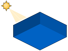
CHAPTER 3 Colours Using and selecting the correct colours to use for your IPA piece is one of the most important aspects of the overall work. Having a bright toxic green house with purple highlights isn't the best thing anyone would want to look at. Just imagine your building or scene, as it would look if you were standing right there. Whether it be bright plastic style, or mid-tone natural colours, it's still your choice. The only thing you have to consider is making the right choice of colours to suit your piece. Using an example of my work below, you can see that I don't really like to use bright colours all that much. Although the colours aren't the prettiest, I think it adds to the overall theme and feel of the piece. If I were to say, create a fun game scene or children's style piece, I would opt for the brighter and happier colours. Remember, if you are unsure about your colour selection, divide the palette sheet in MSPaint into thirds. Then pick your colours from the middle third. This way, they won't have too much contrast or too little. Lighting Next up is lighting. Without a light source or lights your work isn't going to be all that great to look at. If you were to place your building into the real world, it would be pitch black. All your wonderful colour choices would be lost. Of course we are working in a 2D medium so creating real light sources isn't as easy as placing them around our object, ala if we were working in a 3D environment. To create a light source for your picture first choose a place where either your sun or misc light source would be coming from. You can see how I have done it below; my sun has been placed in the top left corner of the scene. Placing your light source behind or directly infront of your building or object doens't really work that well. Because the light is shining either directly from the front or directly from behind (where it would be blocked out by your object), the amount of light is either too much or too little. Shading these types of light sources wouldn't be worth it. You could try it if you want just to experiment, but for now we'll stick to either left or right light sources.
Figure 3.4 As we did in our cube tutorial, we'll place the light source at the top left corner. Now, imagine your object as if it was in a 3D environment. If you have a box and desklamp lying around it would help as well. Now place your box so one of the corners is facing you. Now place the lamp facing the left hand side of the box that is facing you (see example). Now you can see how we are going to shade this thing? One side (the one directly facing the light) is the brightest, the second brightest is the top of the box (because the light is coming from above) and the last side is the darkest. Shading your objects using this method will almost guarantee a fake 3D look, which is what we're aiming for in an isometrical work. Outlines & Highlights Outlining and giving your buildings and objects highlights makes them stand out more, and gives them a polished look. Black outlines help people to distinguish objects from the background and tend to make the object look more cartoonish than say if the outlines were simply darker versions of the objects color. Highlights on the other hand, round off the corners of sharp objects and help the pseudo 3D appearance. If you shine a light onto a square object you can sometimes notice that the very edges shine in the light and appear brighter than the side which has the most light shining on it. Different Styles of Outlines Choosing what type of outlines to use is basically when you decide on the style you are aiming for. As I said before, black outlines usually give your scenes a cartoonish feel (combined with bright happy colours ^_^). The other type of outline needs a bit of explaining. Basically what you do is grab the colour of the object you're outlining and darken it until its in the middle of the original colour but not too darkened. About 2 or 3 times as dark as the original colour was. See example below.
Figure 3.5 |
||||||||||||||||||||||||||

|
||||||||||||||||||||||||||
|


