 |
 |
 |
 |
 |
 |
 |
 |
 |
 |
 |
  |
 |
||||||||||||
 |
|
|
|
 |
  The Complete Guide to Isometric Pixel Art The Complete Guide to Isometric Pixel Art[ October 22, 2004 ] by Rhys Davies aka RhysD A long tutorial made of 7 chapters, covering all the aspects of isometric pixel art: drawing basic objects, colouring, lighting, texturing, drawing people, etc. |
||||||||||||||||||||||||||
CHAPTER 2 The Basic Line Throughout this section I will be discussing the basics of Isometric Pixel Art. The first thing we have to cover though, is how to draw a line on an isometric angle. The straight line in an isometric picture can go in several different directions, really it’s up to you. This of course helps the creator come up with all sorts of shapes and fantastic structures. Below in Figure 1.1 I have created the most simple of all isometric straight lines.
Figure 1.1 As you can see, when zoomed out at normal view the line appears straight and clean. Zooming in closer you can see how the line is formed. The Rule Behind It All All simple isometric lines such as in this particular example have a simple rule you should always follow for clean results. See Figure 1.2 below, which explains how the simple rule works and how to achieve this with every one of your lines.
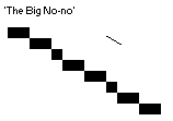
Figure 1.2 The rule takes upon the basic concept of every 1 pixel you draw moving in either an up or down direction, you have to move 2 pixels across. So if you were looking at this line from a birds eye view it would appear straight up and down, vertical. But since this is isometric it needs to be skewed slightly. Apparently the angle of an isometric line is near 30°, but then again it could be exactly 26.565°. Below is an example of how not to draw your isometric lines. I mean you can draw them like that if you really, really want to, but in my opinion it always ends up looking messy and really weird to look at. The example below is 30° and as you can see it looks slightly off, that’s why the isometric line is not exactly 30°.
Figure 1.3 I think that is all we really need to cover about lines. It’s all really basic stuff and most people get it the first time they try. If you don’t just keep practicing and looking at examples. Below are a few different variations of the line, showing different ways you can use it. And yes, horizontal and vertical lines are acceptable, and yes you can break the simple rule, but please people, only if the line ends up looking clean and fits well into the picture.
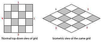
Figure 1.4 The Isometric Grid You can think of an isometric plane or ‘landscape’ as a series of squares that have been joined together to form a larger square. The below image shows us how a normal 2D grid is turned into an isometric grid. The normal grid has simple been moved around, as if it were in a 3D modeling space, so that the view has changed to an isometric view of the ‘plane’.
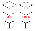
Figure 1.5 In order for each separate smaller grid square to fit in to place, the lines joining both top and bottom need to be exactly the same on each square. In the isometric world (and community) there are two types of common ‘building blocks’ that are used in isometric construction. They are the aptly named ‘Type’ A and B blocks. See below for an example of each type of block.
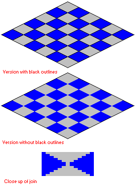
Figure 1.6 In most cases the isometric grid uses the Type B block in order to tile effectively, without any glitches or uneven lines. The left and right sides of the Type B grid block must be two pixels high in order to join and tile effectively. You can see in the example below what I mean.
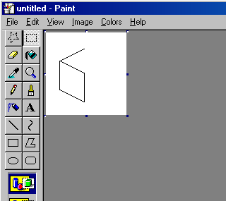
Figure 1.7 Creating Your First Isometric Cube To begin our cube we must first draw up an outline. When drawing your outline, think of it as a 2D square, skewed into a 3D perspective. Draw one side of your cube using the lines that we have discussed before. This is done using vertical lines for the sides of the cube and the angled lines for the top and bottom edges. You can see below my completed side for my cube.
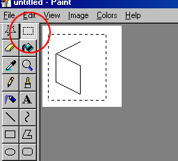
Figure 1.8 As you can probably see, I have included the middle line of the shape so I can line up the mirrored piece in a moment. Now once you have got your side done and you are happy with it; drag a selection around the image using the selection tool as shown below.
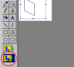
Figure 1.9 Next go up to the edit menu and select copy. Alternatively you can simple press the keyboard shortcut of ctrl+c. Once you have done this you will need to change the masking options for your copied selection. This is achieved by clicking on the second icon which looks like a bunch of shapes on a yellow background, with a floating selection. As you can see the floating selection does not have a white background like the alternate icon above it. This simply means that and colours in your selection that contain your current background colour on the palette, will appear transparent. Below I have highlighted the mask selection box that you need to select, with a red circle.
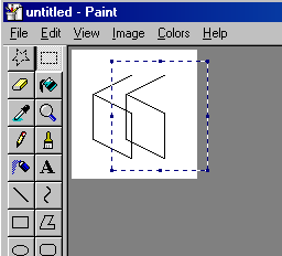
Figure 2.0 Ok now that we’re past the tedious part of mirroring and getting your selection backgrounds transparent, we can focus on creating the rest of our cube. Let’s start by again viewing the edit menu, but this time selecting paste instead of copy. Again alternatively there is a keyboard shortcut that saves you having to use the mouse, pasting something on to your canvas is simple a matter of pressing ctrl+v. Okay, after you have pasted a cloned image of your selection should appear on the canvas. Do not click anywhere on the canvas once you have this floating selection, or you’ll have to undo the process (ctrl+z) and start all over again. Below you can see my floating selection of the cube side I copied and pasted on to my canvas.
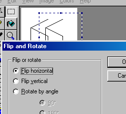
Figure 2.1 Right, now we are going to move the selection across to the other side of the cube that is already drawn up. Hopefully your white background is transparent and the only things visible and moving are the lines that make up the side of the cube. Once the selection is positioned we will need to flip it so it mirrors the other side of our cube outline. To mirror the selection we select the Image menu and then select the option Flip/Rotate (shortcut ctrl+r). A popup menu should appear as shown in the example image below.
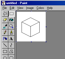
Figure 2.2 Now we want to only flip our selection horizontally so we make sure that the horizontal option is selected. Once done click the ok button and you should return to the canvas with the selection mirrored and ready to be joined to the rest of the cube. To do this simply move the selection across so the middle line overlaps the middle line of the already made side. Well done, you’ve (hopefully) just completed your first outline for a basic isometric cube. It should look something similar to the image below.
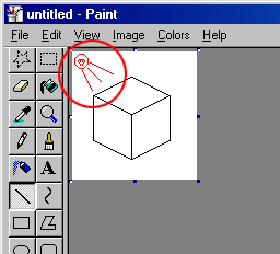
Figure 2.3 Once we have the outline completed it’s time to colour or cube. Let’s use a nice green for this cube. In order to create a sense of 3D within the picture different shades of the same colour are used to create a light source. A light source is simple where the main directional light would be shining from, with the appropriate shadows, light and darkness to follow. For this example our light will be shining from the upper top left of our canvas as shown below. Please note that you don’t actually need to draw on your light source as I have done in my example. You can if it helps though but it won’t be there in the final product.
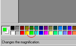
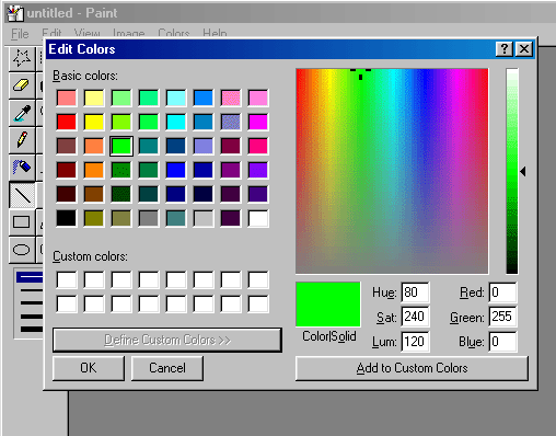
Figure 2.4 The light source is always up to you but in most of my work it usually is in the upper top left of my canvas (we will cover this in a later chapter). Now we can select our green colour. We can do this in many ways, one of the easiest being simply selecting the colour green from the pre-defined palette on the bottom toolbar. Asides from being too bright this green is extremely ugly and over the top. We need to dull it down a bit, but not too much as to have a faded appearance (well you could use the faded look, it’s really up to you.) Let’s now double click on the light green (almost neon) colour from our palette at the bottom of the screen. I have again outlined the step in a red circle below.
Figure 2.5 Upon doing this a popup menu box should appear like below. It contains a whole series of boxes, each containing the default colours. We want to use the advanced options to alter our colour so we need to click on the ‘define custom colours’ button at the bottom of the popup menu. This will widen the popup and you now should have a large colour selection box consisting of all the colours you could imagine! See below for what your screen should look like by now.
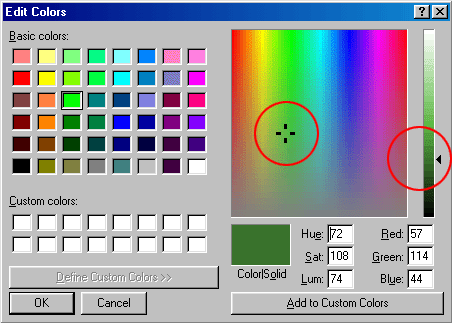
Figure 2.6 To change our default ugly green to a nicer green colour we need to drag the small crosshair shape that is currently up the top of the palette. It is here by default because we have selected the ugly green colour before-hand. If we were to select a different colour it would appear in a different place. To change our colour we need to affectively alter the hue and saturation of it. The hue of our colour is the actual colour we see, whether it be red, green blue etc. The saturation is how much of the colour is retained before it simple fades and you are left with a black or grey colour. The more saturation the brighter your colour, the less and obviously the darker and washed out it is going to be. To get our colour that we want to use for our cube we simple drag the crosshair to about the middle of the palette, still staying within the green colour sections. You can make your green a lot more natural looking by adding some yellow to it. This is done by dragging the cross hair into the part of the palette where green meets yellow. Remember to achieve this colour you will always need more green colour than yellow. Below you can see where I have positioned my crosshair. I wanted a more natural green colour for my cube; you can choose what you want to use it doesn’t really matter. Once you have decided on a colour make it a bit darker using the side vertical bar that shows your colour. To do this, simply drag the slider down until the colour is dark enough.
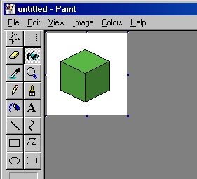
Figure 2.7 Now that we have our colour chosen click the ok button and it should appear as your foreground colour in the little foreground/background box next to the colour palette. Now we can simply get our fill tool (the little paint bucket being tipped over) and click within the right hand side of our cube. The colour should fill the white part within the lines with our colour we just created. As it is the darkest side of the cube (remember our light source), it needs to be a tad darker than the other sides. The opposite side (left side) needs to be lighter than the right side so we repeat the colour process but this time we don’t touch the actual colour selection part but jump in and adjust the brightness of our colour so it is brighter than our colour we used before. Once this is done fill the other side of the cube. Repeat this process of filling with colour to the top of the cube, making the colour even lighter than the left-hand side colour. Now you should have something similar to below.
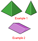
Figure 2.8 Other Objects (Shapes) “Great!” you may be saying now. “Now that I’ve created a cube I can jump straight in to the deep end and start on my first masterpiece!” “Wrong”, I say. What happens when you go to create a roof on your house that requires a different shape other than that of a simple cube? The answer is within this section of the chapter. Hopefully it will teach you how to make some more basic shapes for your creations. First up is the pyramid. You can have normal pyramids or long sections of block with triangle ends. First up we will look at the normal pyramid. Below is an example of how a normal pyramid should look in the isometric style. The sides are straight up and down at a 45° angle. We can change this angle to make the pyramid smaller, as you can see in the second example. If you look closely you should be able to recreate something similar using the same techniques you used to create the cube.
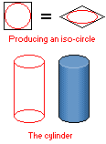
Figure 2.9 Now that you have hopefully got the pyramids out of the way (you can refer back to this section if you need to at any time), we can make some more cool shapes. Now let’s make a cylinder, which are very easy to make. All a cylinder is really made up of are two circles joined by a middle section. Below is an example of a cylinder. To create a circle in the isometric view we first have to make an isometric square, making sure that our circle fits within those boundaries. I have included this process below as well. The shading as you can see, is simply a gradient of colours, going from dark to light. This shading technique gives the illusion of depth as the 2D object is transformed using shadows and highlights.
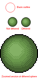
Figure 3.0 On the subject of round things, one of the most difficult shapes to create in the isometric viewpoint is the sphere. Spheres are basically flat 2D circles; coloured and shaded in such a way as to make them appear 3D. The shading is much like the way I shaded my cylinder. Starting from dark and gradually bringing the lightness of the colour up, giving an illusion of depth. As you can see in the example image below, I have provided the basic outline and then the complete piece. Also there is a zoomed in image of the same complete piece. You can see that I’ve used dithering the make the gradient appear less ugly, making it blend in more. Dithering is the process of taking a colour next to another colour and placing a checker type pattern, or sometimes a random pattern of dots within the other different colour. When zoomed out fully the dots and the different colour blend quite well, creating a colour that is somewhere in the middle of the two, thus mixing them and making the join look smooth.
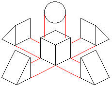
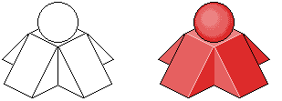
Figure 3.1 Combining Shapes This is where the more fun and creative part comes into play. Now that you know how to make all these wonderful shapes, it’s time to put your hard work to good use. How about making a building with a pyramid top? Or maybe a cubed building with a dome roof? All of these are simple to make and also give IPA the complexity it needs to keep people interested. All you need to do is make each shape separately, making sure that each piece is in proportion. Then using the select tool in Paintbrush move the shapes over and around each other until they look right and you are happy with the result. Just for a small example I’ll be creating a cube which has sloped sides and a sphere sitting on top. The first step is to create your outlines for each of the shapes. As you can see below I have used red lines so each of my shapes are in the correct proportions to each other. Below is an example of each of the shapes I will need for my little structure.
Figure 3.2
Figure 3.3 |
||||||||||||||||||||||||||

|
||||||||||||||||||||||||||
|


