 |
 |
 |
 |
 |
 |
 |
 |
 |
 |
 |
  |
 |
||||||||||||
 |
|
|
|
 |
  The Complete Guide to Isometric Pixel Art The Complete Guide to Isometric Pixel Art[ October 22, 2004 ] by Rhys Davies aka RhysD A long tutorial made of 7 chapters, covering all the aspects of isometric pixel art: drawing basic objects, colouring, lighting, texturing, drawing people, etc. |
||||||||||||||||||||||||||
CHAPTER 6 The Table Tutorial We are now going to create a small dinner table using many of the techniques we have just been through in the past 5 chapters. Feel free to follow along using MSPaint. Step 1. First we will create a rectangle that is exactly the size of our table that we want. Remember how we carved out our people? We are going to use the exact same method to create our table.
Figure 6.0 Step 2. Once I have created my base block, I then create small rectangles on each side of my block, as to where the legs and the top of the table will go. As you can see, I like to do it in a red colour so I don't confuse the current process with the rest of the piece.
Figure 6.1 Step 3. Now I have placed where my legs and table will be, I simply erase the bottom of each of the parts of the table that don't need to be there. As you can now see, we have the beginnings of a table, complete with legs. I now add some depth to each leg by adding on a section until I think it looks about right. Go over the red lines with black to complete the basic table outline.
Figure 6.2 Step 4. I now decided where my light source is coming from and I add the colours accordingly. I find that most of the wooden colours I use come from the lower left hand side of the palette found in MSPaint. Don't make the colour to dull or washed out.
Figure 6.3 Step 5. Now that I have coloured my table, I can add highlights to the edges that need highlights. I also decided on my outlines as to whether or not they should be coloured or left as black. This time I have decided to leave them black but it's your choice.
Figure 6.4 Step 6. There we have it, the basic table. Now all I do usually is add some wood grain texturing to my table to make it look better. To do this I add random straight lines with a darker colour than the base colour. It gives a nice woody texture to it when viewed at 100%. There's your table!
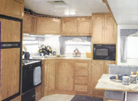
Figure 6.5 Setting The Scene I want you to get out of your chair right now and take a look around the room. See how the furniture is placed? Good. This is how you should set out your scenes, make it so people could actually move around and function in comfort if it were in real life. Think about how you would like to live in such a place, the cool stuff that you would want to have. Think about whether or not the chair should be near the door for good/bad Fung Shui (I have no idea how it works). All of this is extremely important in setting a good scene. For example, you don't want to draw a horror scene and then chuck in a few purple flowers for effect, or just because your feeling nice. Get into the mood, listen to some freaky music or something, anything to help you set the scene you want and to make the outcome as good as possible. Listening to music also helps your creative juices flow. Mini Tutorial: The Interior Of A Kitchen Ok, now to every pixel mad housewife's dream. Pixelling the interior of a kitchen. It can be any kitchen you want. A made up one, your kitchen at home, hell it can even be a kitchen that isn't actually a kitchen. Me, I like to make up my own interiors and designs. So here we go, watch my process and steps carefully and then in your own time make your kitchen from scratch (don't copy mine in other words). Step 1. First step I always take when i'm pixelling a scene, is I browse the net using Google Image Search for reference pictures to help me design and draw (relatively ok looking) objects and architecture. Below are some photographs of kitchens and kitchen objects that I could use in my scene.
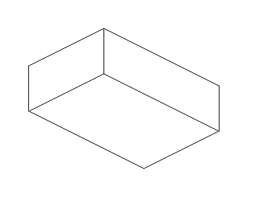
Step 2. Next I draw the basic outline of my room space in which the kitchen will eventually fit in to. Remember to always start with a basic outline and leave all the colouring and shading to last. As you can see below, my kitchen is a basic cube shape with one side being longer than the other.
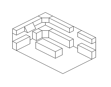
Figure 6.5 Step 3. Ok, now inside of my cube I begin to map out and draw the cupboards and overhead thingys that kitchens have. Take your time in this particular section and plan out where you are going to place things. Look below at my example and you will see that I have some nice benches and cupboards.
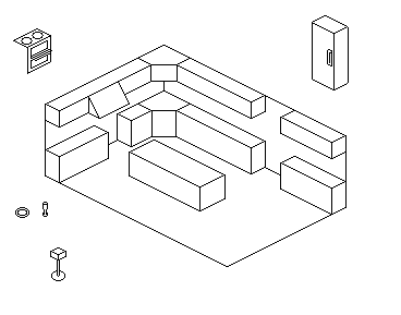
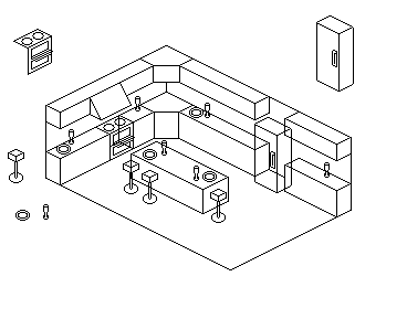
Figure 6.6 Step 4. We've got benches and cupboards and overhead thingys, now we need some objects. Objects include such things as refridgerators and ovens, even plates and glasses. Ok, around the outside of my scene I start to draw all the objects I want to place around my kitchen (remember to keep them as isometrical as you can). I then select each object and place it where I want it to go in my scene (look in the second example picture), or copy and paste it and then place it around my scene. Such things as plates or glasses can easily be copied and pasted to save you the trouble of recreating them each time you want to use one in your scene.
Figure 6.7
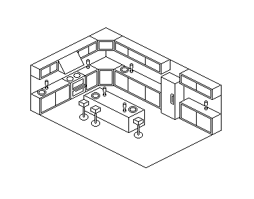
Figure 6.8 Step 5. Look at how messy my scene is! To fix this all we need to do is go around the scene, erasing lines that would appear behind other objects. Once this is done you should have the basic outline of your entire scene. Look at my scene so far if you are unsure of what I mean.
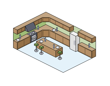
Figure 6.9 Step 6. Ok, now we colour it in like a colouring in book. Get your fill tool and go around your scene, colouring everything to your satisfaction. Remember to use darker shades of colours to give objects shading and always remember to use a light source when you are shading your scene.
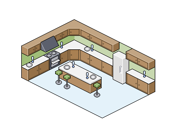
Figure 7.0 Step 7. After colouring and shading, it's time to highlight. Go around your scene and find the sharp edges. Things such as the edge of a cupboard or benchtop will need a highlight. Once you have done this it should look similar to mine below (don't make it exactly like mine or you won't have learnt anything.)
Figure 7.1 Step 8. Add a few people that you've created in the other tutorials or just leave it how it is. Save the BMP file as a GIF or PNG in an image editing program such as Photoshop or The Gimp (freeware). Please remember not to save your work as one of these filetypes in MS Paint. Paint tends to totally ruin your work if you attempt to save it as something other than a BMP. Show it off to your friends and family and receive criticism as to where you could improve next time. Always remember to take comments as a learning experience, and don't get angry if they are negative, just improve on it next time. |
||||||||||||||||||||||||||

|
||||||||||||||||||||||||||
|


